For our next project, we were assigned to create an infographic about disease spread on a cruise ship (I think). According to the PDF the class was provided with, from my understanding, the infographic had to meet the following requirements:
- Appeal to a scientific community of epidemiologists
- Have a min 200ppi resolution as it will be in a scientific publication
- Be centered around a 3D cruise ship
- Show all the components of an infectious modeling system
- Study an infectious outbreak on a cruise ship
The information provided is still kind of vague and left me with so many questions. Is there a specific article the infographic is for? Is the data already provided? What are the components of an infectious modeling system? Are there design restrictions on the color and layout?
After a google search, I think I found the components of an infectious modeling system as seen in the graphic below:
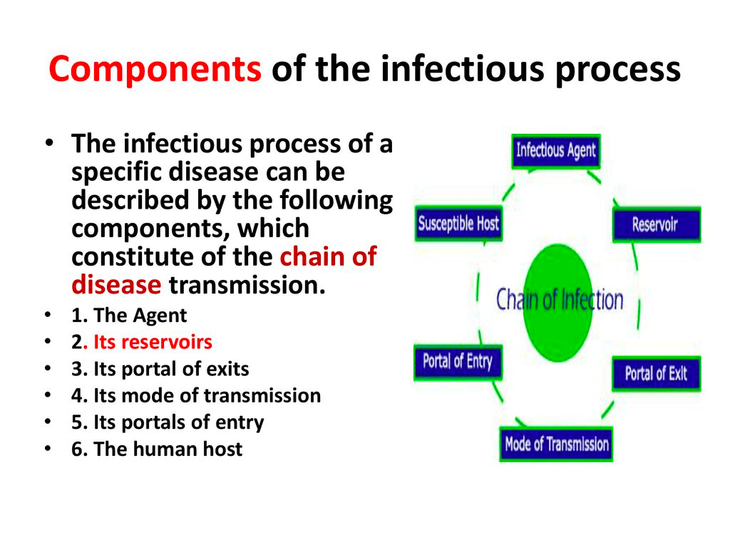
One question answered. Yeet.
Without further information from the client, my partner and I came up with a (very) rough draft:
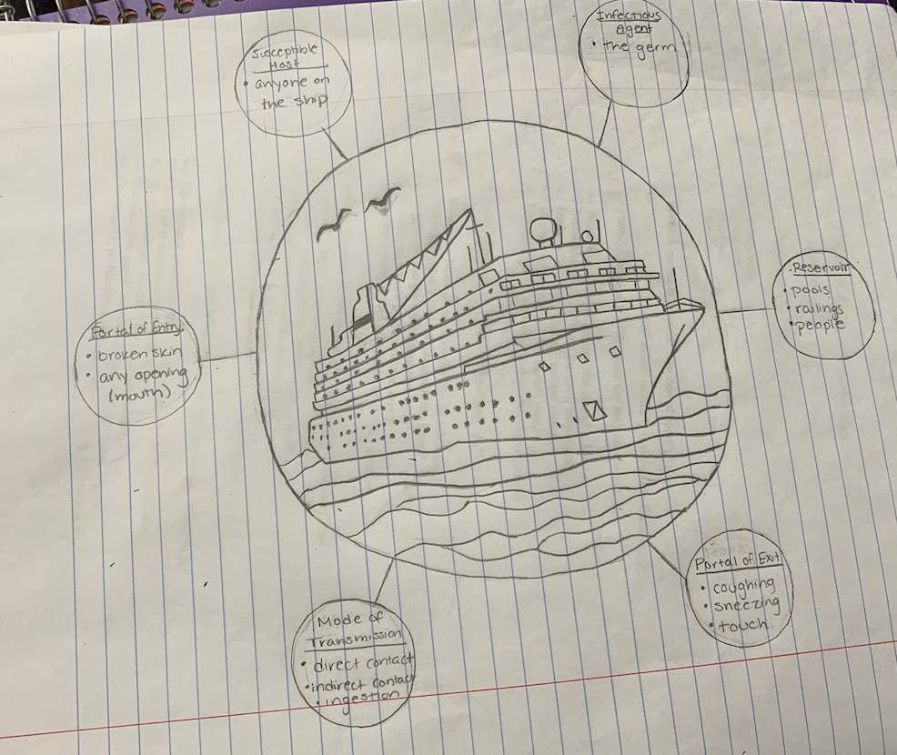
Our initial draft consisted of the ship centered with bubbles coming off of it. We wanted to have zoomed in images of each room. We thought our client wanted to see areas such as the bedrooms, pool/recreational areas, and the different levels of the deck in each of the bubbles. However, because this was only a first draft of our infographic, we did not have time for the zoomed in images. We personally thought the layout was a little confusing, so we wanted to fix it. According to American Statistician Edward Tufte, “There are right and wrong ways to show data. There are displays which reveal the truth and displays which do not” (Tufte 20). We wanted to make sure we were sending the right message, but at this point, we were unclear of message our client exactly wanted. We were unsure what information the audience was intended to gain from our infographic–were they supposed to see the specific virus hotspots, the stages of the virus itself, the methodology used, or a summary of the entire article? We wanted to make sure that our client’s data was shown in the right way.
Sources:
Tufte, Edward. Envisioning Information. Cheshire, CT: Graphics P, 1990.

I think we all had similar questions and confusions when we first the prompt given from Professor Korkin. I think your first draft does a good job at making it clear for the reader to understand the main point of the infographic, as gravitates all of the attention to the center of the page. I think that if you provide a larger illustration and more specific pinpoints of the blocks of text to what it is referring to, it will help make it clearer to the audience, while it is important to utilize whitespace effectively, I would imagine that there is still space that can be supplemented by information and illustration to contribute to your ideas!
As a side note, I would suggest for your blog to display all your posts, as it took me quite a while to see this one. I am excited to see your revision process!
LikeLike