While working on our second draft, we were provided with much more information. Our client, Professor Korkin, came to our class for a quick project presentation and question and answer session. He also provided us with plenty of information on his method and research via email.
So here is what we are supposed to do, really:
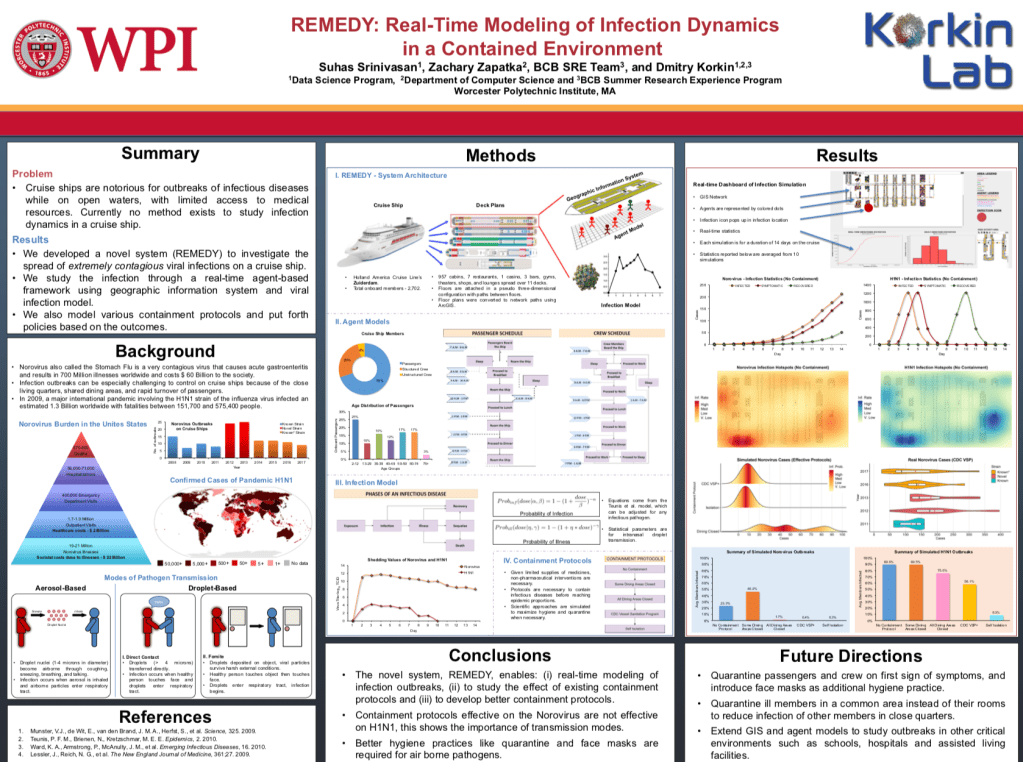
Professor Korkin and his students were researching disease spread on cruise ships and developed a methodology of the best way to counteract it in a real life scenario. Their research was inspired by the recent coronavirus outbreak: specifically on cruise ships.
Learn more about current coronavirus outbreaks on cruise ships here
The infographic will be used in his journal publication if selected. Professor Korkin has the following vision for the chosen infographic:
- Cruise ship–centered, 3D, show levels, decks, and dining areas
- Humans –passengers, crew, age, healthy and sick
- Virus–location, spread, patterns
- Contamination Protocols–hand sanitizer, quarantine, closed areas, face masks
Here is the final poster presentation based off their research:
Additionally, Professor Korkin posted a Youtube video modeling how the Norwalk virus (fake disease they choose to simulate) spreads on a Cruise Ship:
Check it out!!!
Now, time for a second draft
Once we had been given more information, we started thinking of different layouts. We knew our client wanted the infographic to be on half a sheet of paper horizontally which influenced our layout. We decided to split up the page in PowerPoint.
Our second infographic is a huge improvement from the first:
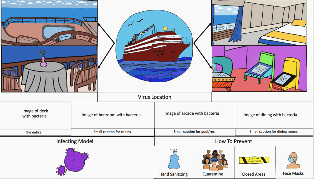
This version of our draft has the cruise ship in the upper-middle with arrows pointing to the zoomed in sections. Below that section was supposed to be the zoom-ins of the already zoomed-in pictures with viruses on them. We were not able to complete the middle row of images in time to present it to the class (last minute change in device availability) but this is what we came up with. Finally we included the containment protocols by incorporating icons to make the graphic more humane. Ideally, we’d like to reflect the elements that we learned from the readings in our infographic. For example, writers Sam Dragga and Dan Voss argue that technical information often lacks the humanistic approach and just displays the facts (Dragga). Since our audience is epidemiologists, they already know the hardships of disease spread and understand the terrible process; however, we want our graphic to show the positive side in how to stop disease spread. We want the viewer to understand the impact of disease spread on a cruise ship, but then also recognize that no one is doomed by showing Professor Korkin’s methods to subside it.
We need your opinions!
To create our infographic, we hand drew the images and scanned them. We used Autodesk Sketchbook to import and color them. We are open to suggestions if there is another, easier way to create the graphic because this tends to be time consuming in absence of a stylus pen!
We also still have questions of the info for the graphic: how much should be included? Is this something that we will add, or will Professor Korkin add it on top of our pictures? Should we leave room besides the images for text?
Dragga and Voss also suggest including text to compliment the image and provide a sense of ethics, so this is an approach we could look into given Professor Korkin’s preferences.
Will ship + text + other images be too crowded? Let us know what you think!
Sources:
Dragga, Sam & Dan Voss. “Cruel Pies: The Inhumanity of Technical Illustrations.” Technical Communication 48 (2001): 265-74.
