Finalizing our infographic: the breakdown
After hours of trying to learn other software, we finally were able to use Illustrator to create the cruise ship for our infographic (yay!!). This gave us much better results than Autodesk Sketchbook (saved our fingers the pain too). We were able to create the infographic at 300 ppi as our client requested. Additionally, we used powerpoint to create the text boxes where information would be placed and is ultimately how we connected the pieces of our infographic together.
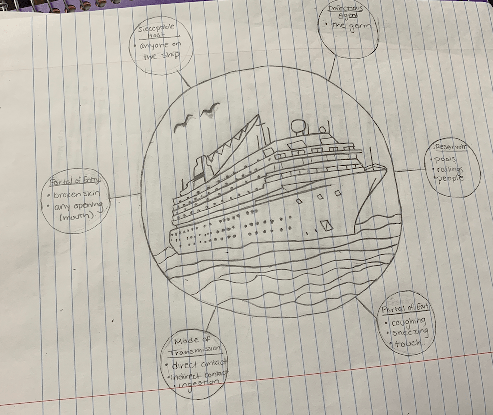
From what started as a pencil drawing:
Has developed to
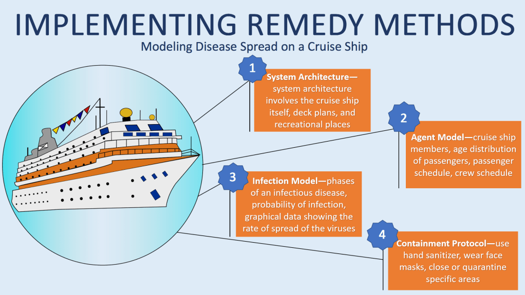
For our final draft, we muted our colors (as often seen infographics) and stuck to a theme of blue and orange contrasting colors to increase readability. We thought our previous color pallet was too wild and the cartoons too unsophisticated (maybe we could use it for the cartoon unit!). After going to office hours and spending two hours on the ship, we finally were able to use Illustrator. We traced and filled the image in easily and precisely by using tools Illustrator provides. We also simplified our layout to focus on the methodology behind disease spread which was our client’s intended purpose for the infographic. We only included numbered text boxes describing each step of Professor Korkin’s method in the absence of pictures. We thought that although pictures would make the infographic more humane, it may cluster the infographic and turn the viewer away due to the complexity. The text boxes are intended to provide a brief summary of each step in the method, and allow the infographic to have more white space. The white space rhetorically serves to draw the viewer’s attention to the ship and boxes in our infographic, simply because there is noting else there to observe. Even Dragga and Voss admit that no one actually includes humane pictures accompanying data, because on a scientific level, the additional pictures can be distracting and unnecessary (Dragga). Efficiency and readable are prioritized in scientific data rather than humane sensitivity–this is the approach we took in our final draft.
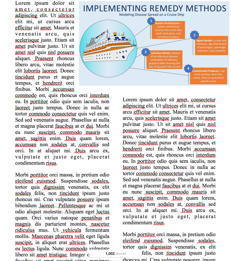
For fun, here is what our infographic would look like on a scientific document:
Based on where we started, we think this is a huge improvement considering the fact that we had no experience in Illustrator. If we had more time, we would explore other layouts and shapes to display the information. If we get the opportunity to continue to work with Professor Korkin, I’m sure that our final draft will be tailored even further to his liking.
Also, we would encourage everyone to try using Autodesk Sketchbook and Illustrator for future graphic design projects! Autodesk Sketchbook can be downloaded for free here, and Illustrator can be purchased by clicking on this link.
Finally, Professor Korkin is in the news!
The link below is to a recent article on how Professor Korkin developed a 3D model of the coronavirus!
https://www.telegram.com/news/20200211/wpi-professor-develops-3d-model-of-coronavirus
Please leave comments about what you think could be improved and if you like our final design!
Sources:
Dragga, Sam & Dan Voss. “Cruel Pies: The Inhumanity of Technical Illustrations.” Technical Communication 48 (2001): 265-74.

I like the color scheme on this version! It makes it very approachable and easy to look at while also separating the data relatively nicely.
LikeLike
I love how this shows your progression in drafts! This version is drastically different from your previous draft, and it looks great. The colour palette really helps with making sure you notice the image is there but does not distract you from the importance of the text. One thing I might caution you on though is having white text. Depending on how many times the image is photo-copied, the white text might disappear or fade into the colour of the boxes around it. Otherwise, this is awesome, and I like how you put it into a body of text to give us a real view of how the graphic will look when printed.
LikeLike
Really love the final draft, step by step explanation of the model a nice image of the ship overall very simple but covering the necessary information very well.
LikeLike
While this final draft isn’t what I was expecting, especially after viewing the iteration that you brought to the workshop, I feel as though it’s taken a step towards accommodating the customer’s scientific audience. With keeping the design simple and bare, it gives the customer plenty of room to incorporate their research without fear of the setup being too noisy. Including your design in a scientific article is also a really nice touch that’ll help the customer not only visualize how their work will look on your infographic, but how your infographic will look in their publication.
LikeLike
Your infographic has grown so much since your first drafts! I agree that your illustration now looks much more sophisticated and professional due to the vector graphics illustrator provides. I also think that having all of your text boxes on one side of the infographic helps make the infographic more cohesive because while all the text is in one section, the pop outs allow it to stand alone based off of the sections of the ship as requested by Professor Korkin. I think you guys did a great job incorporating your original ideas into your final draft and fulfilling the requirements your client requested!
LikeLike
Nicole and Nupur,
Great work on using the class’ feedback to create this final info graphic. I think he way you divide the page into text and image halves gives the viewer a clear direction to read. Additionally, using your final draft in a setting of a paper was an excellent way for the viewer to visualize the use of the info graphic; it forces the client to imaging using YOUR product for themselves.
The use of illustrator was super for a first time user, and it really sets apart your model from the others. this type f info graphic is colorful, inviting and entices me to read. My favorite thing about this info graphic is how concise and clean the final copy is. although i would suggest adding some other smaller visual representing disease, help or illness in some way just to be even further to the reader the purpose of the graphic. Excellent work and good luck on the info graphic moving forward.
Eddie Hay
LikeLike
I love that the colors of the boxes matches the color scheme on the ship. It is a very cohesive infographic. I’ve really enjoyed seeing the progression of your design!
LikeLike
When I saw this I was so surprised at how different it was from your original drafts. You guy’s definitely made a great use of color. I love how everything matches and because we read from left to right you did a good job at putting the ship on the left, the first thing we’ll see. I also noticed the text boxes are in a Z formation which is also how we read. Good design, I do have to say that it may be lacking in specificity in regards to the different areas of the ship but besides that this design works!
LikeLike