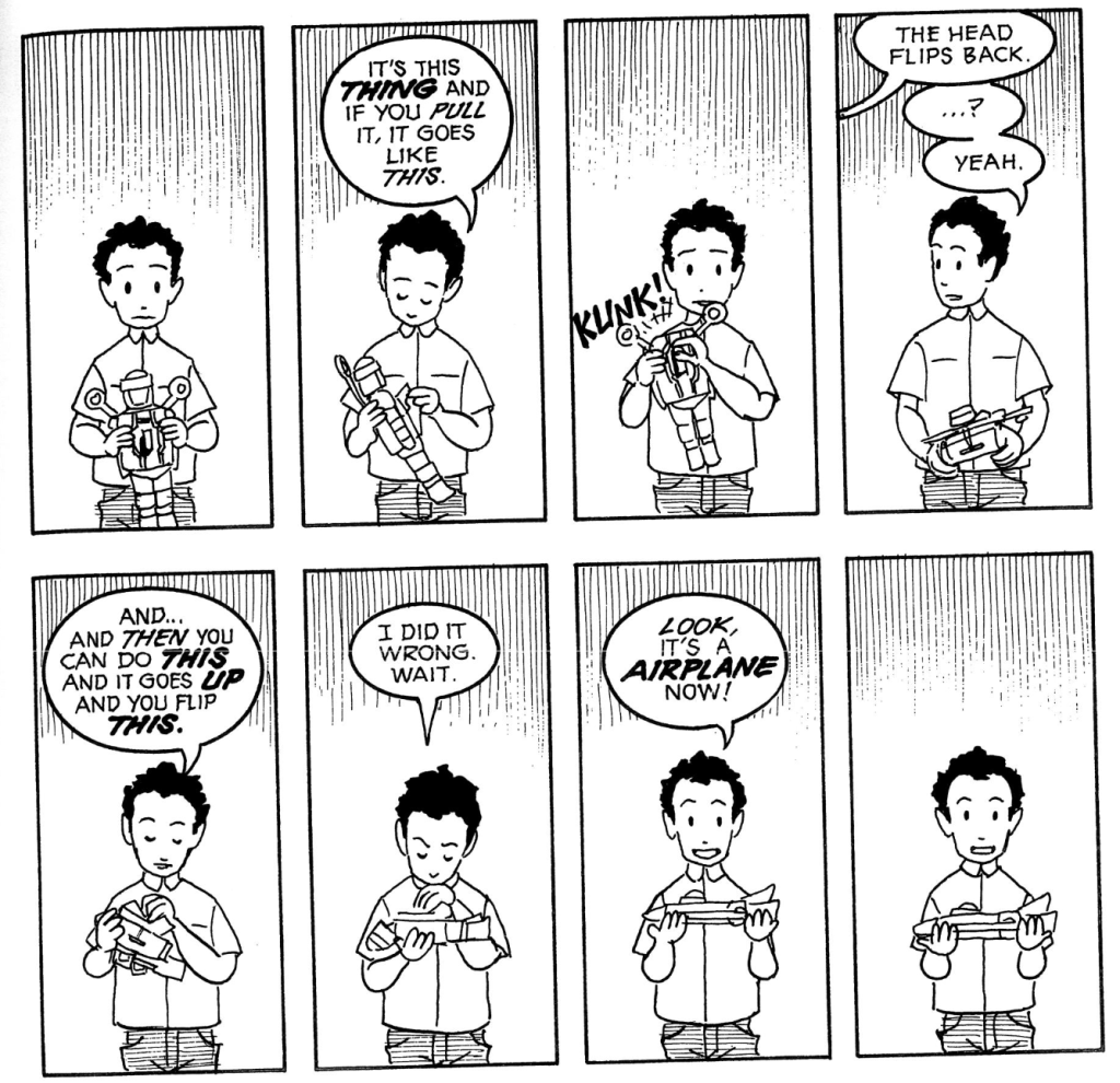
For our final draft, we decided to color in our comic by hand (neither of us have experience using illustrator). Some feedback we received on our initial draft was that it was very clean, and we felt that because of its cleanliness and hand drawn style it would be more appropriate to color it in by hand. We are planning to hang our comic up in the Morgan dining hall, so right now we don’t envision our comic online (besides this blog, of course). That being said, we chose a color pallet that will allow the comic to be easily replicated.
Here it is:
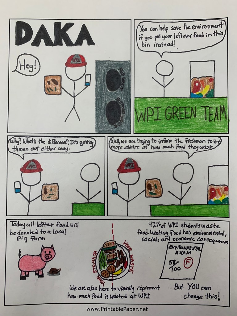
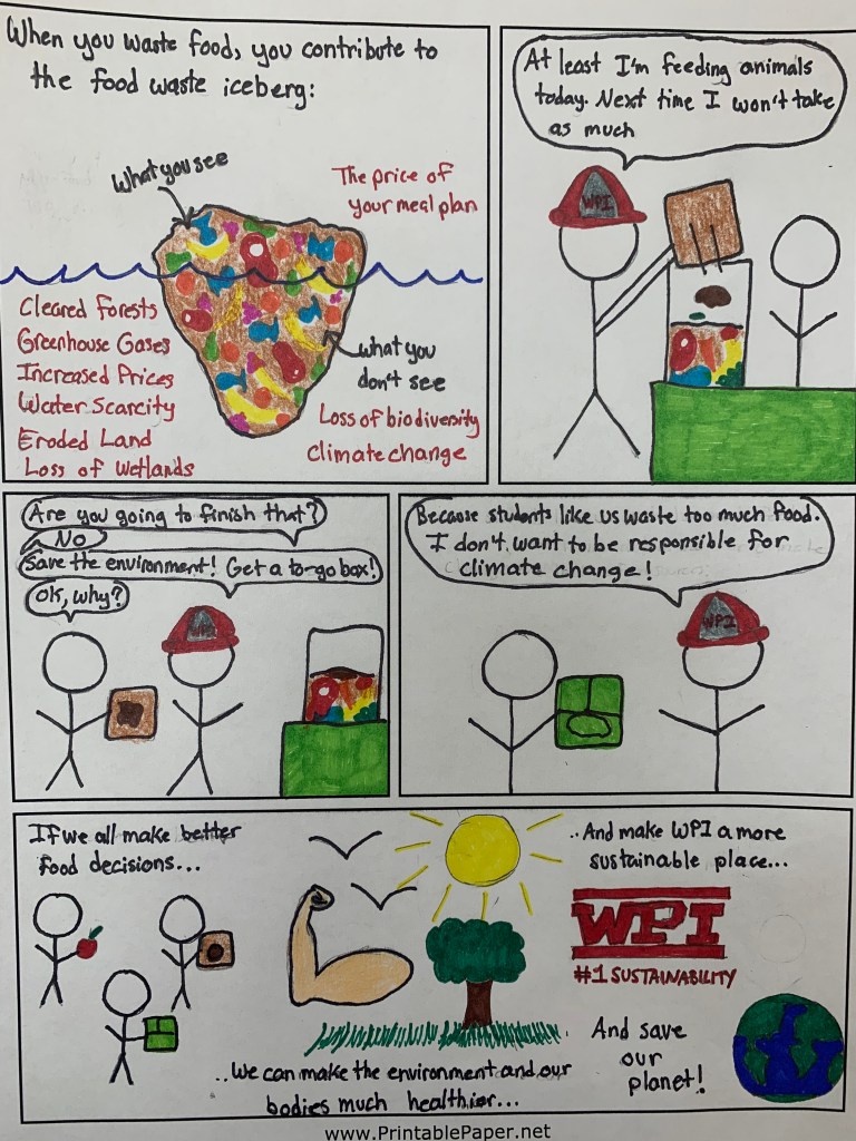
We made certain changes based on the feedback. The biggest adjustment was that our comic was mainly using the logos Aristotelian appeal. Our comic was missing ethos-a character connection with our audience-and pathos-a sense of why we would want our audience to make sustainable decisions and how these decisions affect them. To increase ethos, we made the student in our comic wear the WPI hat that all freshman receive at orientation. This way our previously arbitrary character is easily recognizable as a new first year student at WPI. To incorporate pathos into our comic, we made adjustments to the dialogue. On the first page, the member of the WPI Green Team now explicitly states that freshman, specifically, waste food in the dining hall. On the second page, the WPI Green Team member explains the things that the student can do to help themselves and the environment–and makes them feel responsible for the consequences. On our final page, we changed the Food Waste Triangle to a Food Waste Iceberg–this concept is to display all of the consequences of wasting food that students don’t see once they dump it in the “Food Waste” bin. The purpose of including this is to make the student feel like they are adding to the iceberg–and is a call to action to reduce waste. When a student with food waste approaches our first year student in the comic, he convinces the other student to get a to-go box because he feels guilty. We hope that our comic will show students that the decisions that they make do have an impact on the environment, and that they can encourage others to make the same sustainable decisions.
Here is link to another blog that describes ethos, logos, and pathos used in comic strips.
In Scott McCloud’s comic Understanding Comics, McCloud emphasizes that a comic’s function is to “show and tell,” and that comics can be scholarly or informational (McCloud). We believe that the final draft of our comic is set up to show a real-life scenario that first year students can relate to and tell the storyline behind it. The narration in the comic includes statistics and facts about food waste, giving the comic an educational tone rather than silly (as some people would perceive comics as).
Now that we’ve shown you our final comic, please tell us what you think!
Sources:
McCloud, Scott. “Writing and Art” in Understanding Comics: The Invisible Art.2 Ed. 1993, Kitchen Sink Press. 1st print: New York, HarperCollins. 1993.
If you are interested in seeing where we got the information for our comic or learning more about food waste, check out the following links:

I think this is an excellent way to reach morgan dining hall users. I also love the hand-drawn style and coloring job.
LikeLike
Thanks Nick! We appreciate your feedback!
LikeLike
I think this comic does a great job at balancing pathos, ethos, and logos to convince the reader to listen to your message. It also think it’s great that you referenced Understanding Comics while creating yours. The images make it easy for first year students to relate to, like the WPI hat will catch the attention of a student at orientation, and the Green Team bins will catch the attention of a student that has been at WPI for at least a few months.
LikeLike
Thanks Colette! We really appreciate your feedback and are happy that you were able to pick up on what our comic intended!
LikeLike
The “food waste iceberg” is a really cool idea and I think it really drives the point home. One connection I made was with the Great Pacific garbage patch, which really drew my attention to just how much of an issue food waste is. I also liked the small details that you incorporated, such as the failed “Environmental Exam,” since we all know that failing an exam is not a great feeling, so it definitely lends to getting your reader to take action. Great job guys, I like how it turned out!
LikeLike
Thanks Andrew! It’s cool that you made that connection from the food waste iceberg because I did not think of that myself. It’s really interesting to know the different messages people receive from the same image–this kind of goes along with what we’ve been learning in class. Thank you for your feedback and I’m glad that you like our final design!
LikeLike
I love the final draft! I think your addition of character wearing WPI gear which students can relate is amazing and really creates that ethos connection necessary to convince the reader of your argument. I like the color palette you chose and the drawings are so cute!
LikeLike
I appreciate how efficiently your illustrations amplify your text. A big part of this success, in my mind, is how simplistic and clean your images are. While each one is representative of your text, none of them appear to draw attention away from your ideas. Additionally, they all–in addition to your narrative–contribute to a compelling charm. Out of all of your illustrations, I especially liked the idea of the “food iceberg”, which is a concept that could be explored more and turned into a “titanic” narrative.
LikeLike