In class earlier today, we had the opportunity to share our drafts with the class and receive feedback. Again, we showed the following image:
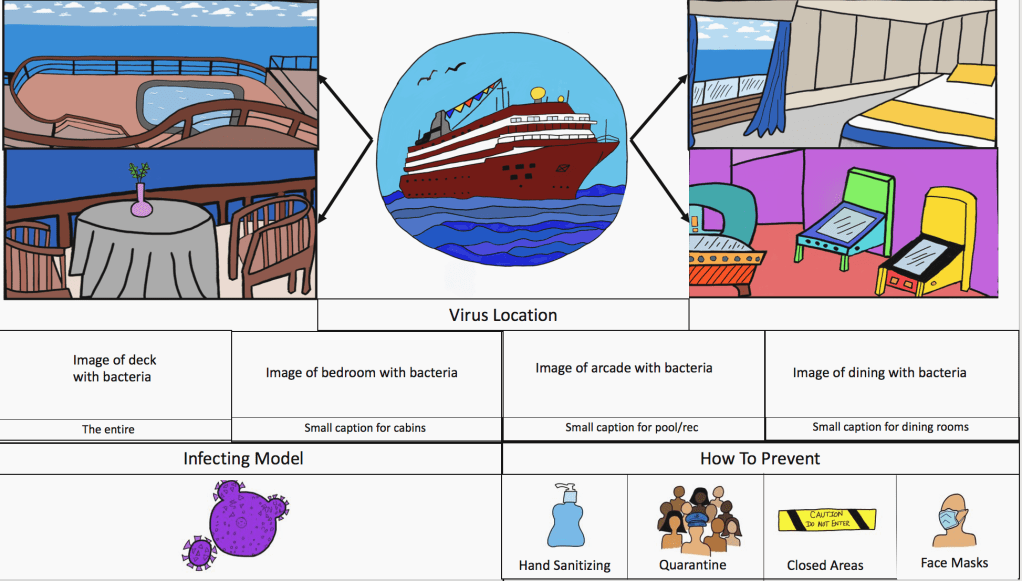
Feedback we received
What people liked:
- Idea of showing the “zoomed in” virus locations
- The “How to Prevent” box
- Combination of elements we have
- Cartoon-y feel
What we could improve on:
- Create a better flow in display (people read left to right, up to down)
- Focus more on the methodology aspect
- Use a muted color pallet
- Use illustrator instead of Autodesk Sketchbook
We really appreciated everyone’s feedback today! For our next draft, we are going to meet with Karen to figure out how to use Illustrator. Neither of us have ever used it before so it should be exciting!
For our next draft, we were thinking of making the layout similar to these images:
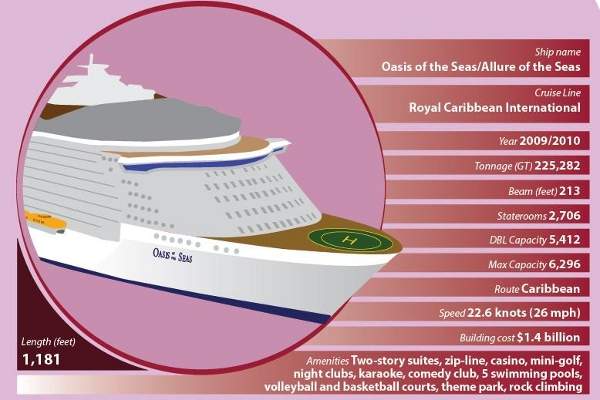
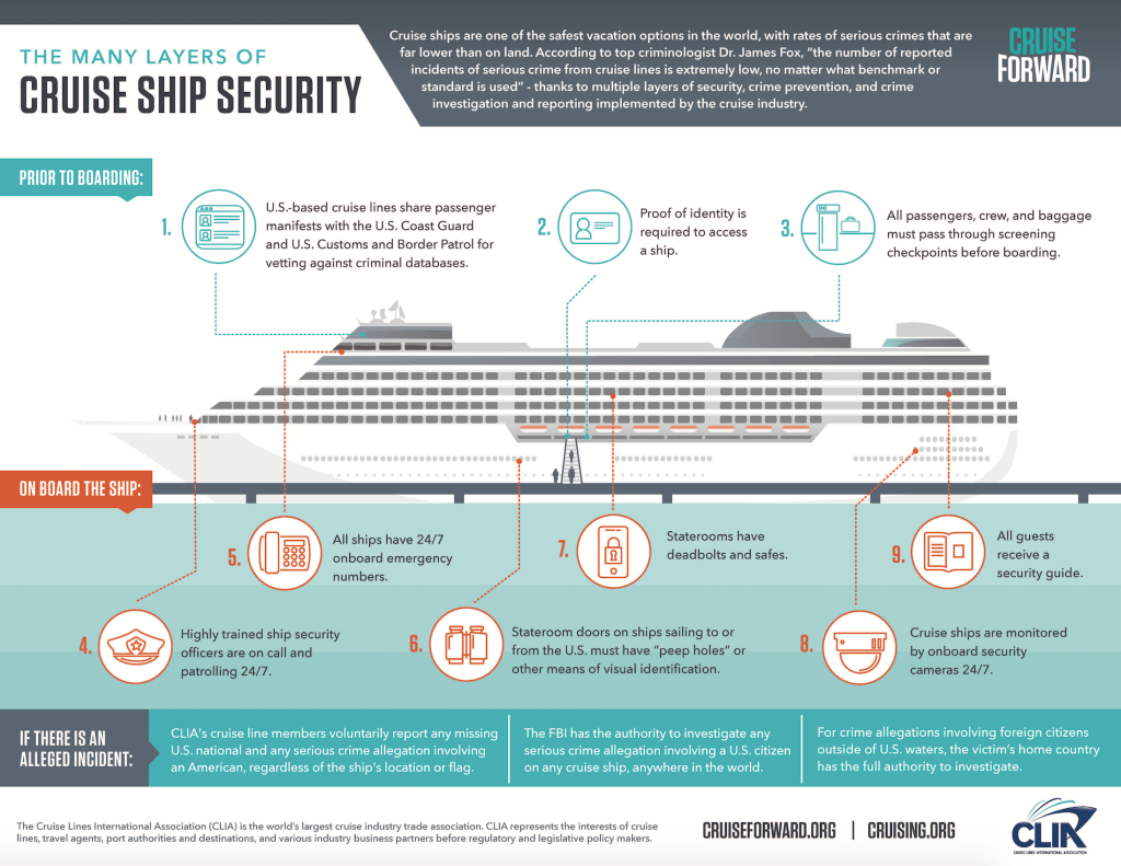
We probably won’t use pink, but these images have more of a muted pallet than our previous design. The infographic on the right has a color scheme that we would more likely use. The image on the left has the 3D cruise ship aspect, room for information, and a good balance of text, image, and white space. I think a model like this would be more appropriate for Professor Korkin’s journal. For our final draft, we can envision the previous cruise ship we drew (but different colors) where the one above is now, with viruses floating around it to show it is infected. Instead of lines of data, we could make four blocks coming off, similar to the set up of the infographic on the right, each describing a component of Professor Korkin’s methodology.
Let us know what you guys think!
Bonus Content!!
If anyone is looking for the APA citation for the “Understanding Freud” comic, here is a link to it:
https://www.worldcat.org/title/freud-for-beginners/oclc/4983593?page=citation
And by the way…thanks for checking out our blog!

I think you are going in the right direction, you guys have some great ideas and I am excited to see what you have for the next class!
LikeLike
You guys have a great start with how you are planning on incorperating specific illustrations of each section on the boat so that people will have a clear idea about what the infographic is talking about! I think that using Illustrator would also be beneficial for you guys as it probably will help make creating the illustrations easier and look more sophisticated, aiming toward the scientific community. I think using a muted color palette is also a great idea as the colors become less distracting to the readers and they can focus more on the message of the images, rather than the image itself. Additionally, I think that if you guys incorporate the words nearby the photos it would help the reader make that instant connection between the image and the messages the words are conveying. I’m excited to see how your final draft will come out!
LikeLike
I really liked how you have the cruise ship centered and then have the different sections coming out off of that. One thing I would suggest for that is making the colours a bit more muted so they don’t distract from the overall infographic. I definitely agree with you that using Illustrator will be a lot easier, and will make your life a bit less hard. Have fun learning to use Illustrator, I can’t wait to see your next draft!
LikeLike
I appreciate how your design is divided into clearly defined sections and utilize graphics to replace simple ideas (such as with the “How to Prevent” section). I feel as though the setup makes the graphic easy to read for the average person and goes a long way to humanize the topic by making the audience visualize the scenario through your pictures. My only concern with your design is that, while it is nice for the average person, it doesn’t seem to be geared towards the scientific community. Even so, I believe that this concern will be alleviated with shifting your design towards one of the sample info-graphics that you’ve provided. I do hope, though, that you still incorporate your images into your design, especially if you model your design after the “Cruise Ship Security” example.
LikeLike
I think you guys are totally on the write track. I love the way that the images are separated as I gives a very clear set up. The examples you chose to model your cruise she off of seemed very professional looking. The only suggestion I have it muting the color pallet a bit and maybe decreasing the amount or colors you use:)
LikeLike